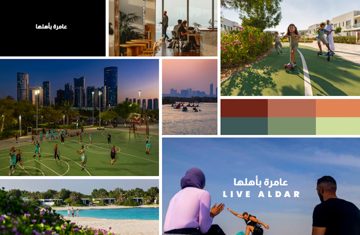
We become a driving force that enriches lives by creating experiences that connect people, communities, and cultures.
Our Logo
Brand Overview
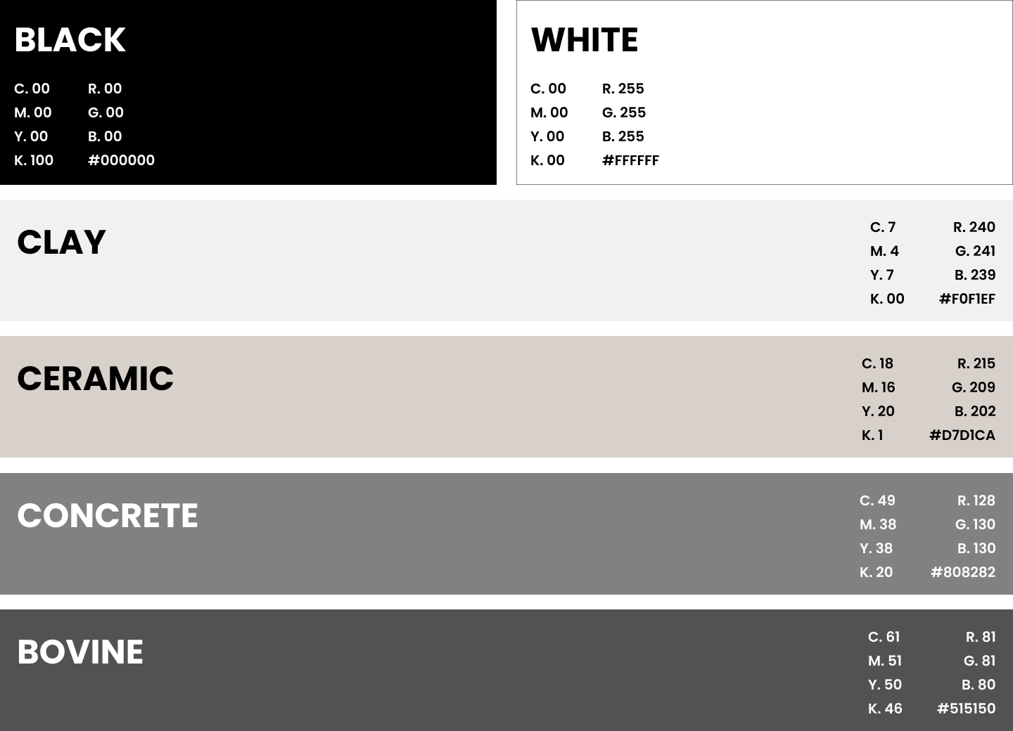
Primary Colors
Secondary Colours
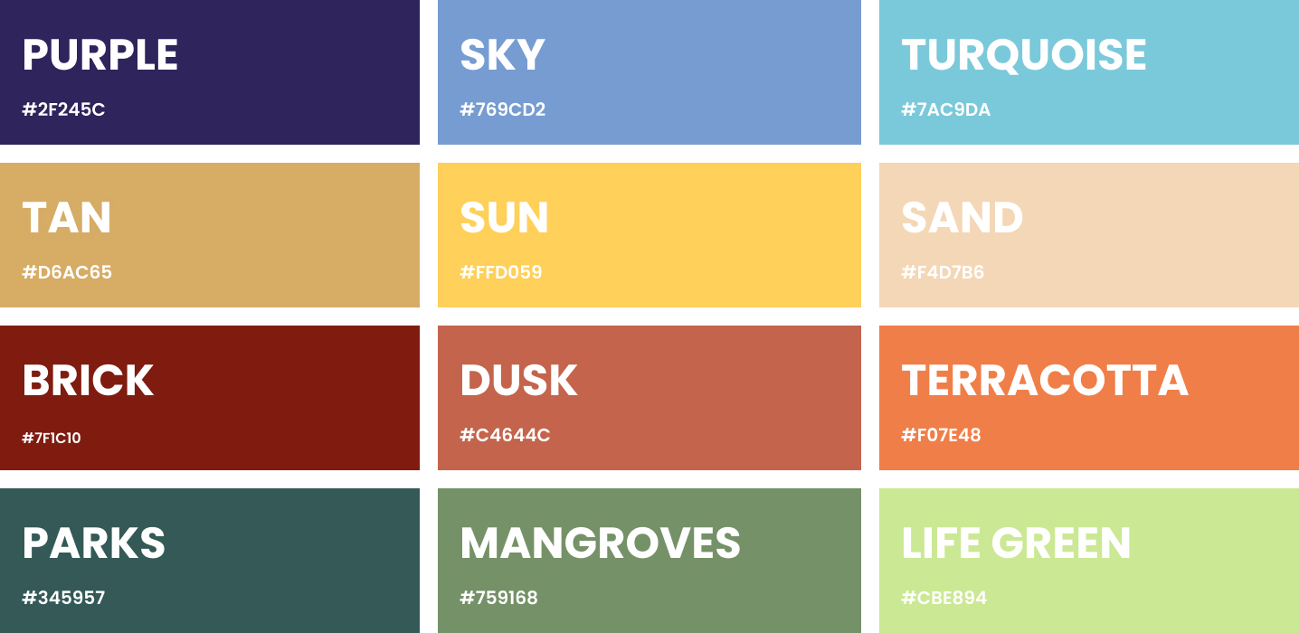
Dynamic Tones
We have four groups of accent colours that are used very subtly to add character to the palette. It supports the primary palette by adding personality in a very considered and sophisticated manner whilst reflecting the Aldar brand.
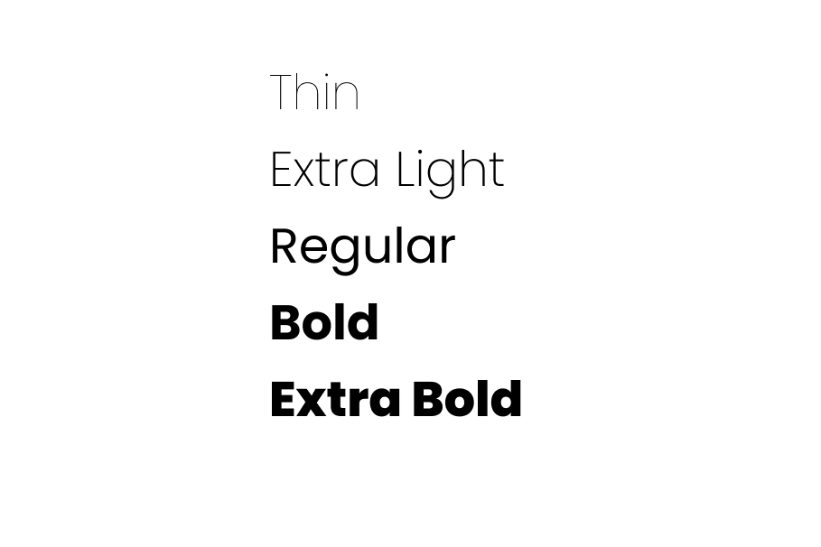
We use Poppins